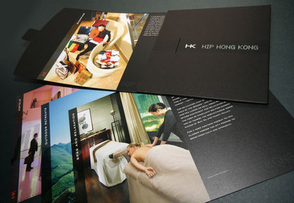
Designed as a promotional pack targeting journalists, the Hip Hong Kong pack highlights details of the best places in Hong Kong to visit.

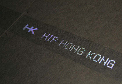
The cover was made from black card over-printed with a high gloss varnish, and finished with a refractive foil block logo.

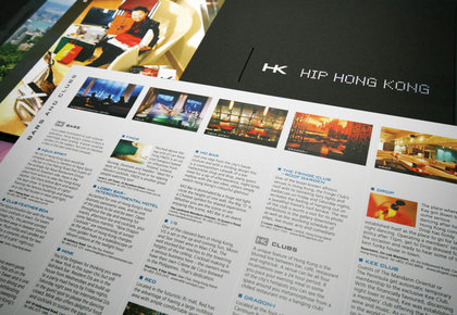
Each of the eight inserts focused on one aspect of Hong Kong's attractions, fitting a lot of information onto each sheet.

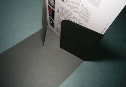
To reduce production costs, the folder was created in a way that didn't require any gluing.
Hip Hong Kong
Client: Hong Kong Tourism Board
Following a three way pitch, ODC was awarded the job of producing a pack highlighting details of the best places in Hong Kong to visit.
The pack consisted of eight inserts, placed inside a black card folder. An HK symbol was designed, combined with a dot matrix font and foil blocked onto the cover using a light refractive foil.
The front of the inserts hold a general overview for that sector, while the reverse holds the details. The folder was designed to ensure the whole pack held together without the need for any gluing, thus reducing overall production costs.